
What Is NPS? The Complete Guide to Net Promoter Score [2026]
NPS is the most widely used loyalty metric in the world, and also the most frequently misused. Indeed, the score means nothing without follow-up. Here is how to use it properly.
![What Is NPS? The Complete Guide to Net Promoter Score [2026]](/img/knowledge/nps.svg)
- NPS measures one thing: how likely a customer is to recommend you. Promoters (9-10) minus Detractors (0-6) gives the score. Passives (7-8) sit outside the formula but rarely outside your churn risk.
- A score means nothing without context. An NPS of 30 is strong in telecoms and mediocre in retail, and Nordic respondents score 5 to 15 points lower than US ones for cultural reasons alone.
- The number is the least interesting part. The value is in what you do within 48 hours of receiving it.
- Quarterly is not the cadence you retreat to out of fear of survey fatigue. In CustomerGauge's Decade Edition benchmark data, quarterly is the cadence with the highest average retention rate.
- The 2026 worry about AI faking survey answers is real, but it is a paid-panel problem. In B2B your risk runs the other way: too few answers, from too few named people, at accounts that are too large to guess about.
Contents11 sections
Fred Reichheld published "The One Number You Need to Grow" in Harvard Business Review in 2003. Two decades later, NPS is the most widely used customer loyalty metric in the world. It is also the most frequently misused. Companies track the score, debate whether 32 is better than 28, and present dashboards at quarterly reviews. Then they do nothing with the feedback.
The score is the least important part of NPS. The conversations it triggers, the root causes it surfaces, the improvements it drives, that is where the value lives.
What Is NPS (Net Promoter Score)?
NPS is a customer loyalty metric built on a single question: "How likely are you to recommend [company/product] to a friend or colleague?" Customers answer on a 0 to 10 scale, and the answer places them in one of three groups. It comes from Fred Reichheld's 2003 Harvard Business Review article "The One Number You Need to Grow", and two decades later it is still the most widely used loyalty metric in B2B.
- Promoters (9-10): loyal advocates who actively recommend you. Your growth engine.
- Passives (7-8): satisfied but unenthusiastic. Vulnerable to a competitor with a better offer. They rarely recommend you to anyone.
- Detractors (0-6): dissatisfied customers who can damage your reputation through negative word of mouth, and who are usually already talking to someone else.
What NPS measures is long-term loyalty and recommendation intent. What it is good for is strategic overview, benchmarking and early churn identification. What it is not good for is diagnosing a specific problem, which is a job for other metrics further down this page.
The Calculation
The maths is deliberately simple:
NPS = % Promoters - % Detractors
Passives are excluded from the formula. They should not be excluded from your strategy.
| Group | Score | Responses | Share |
|---|---|---|---|
| Promoters | 9-10 | 100 | 50% |
| Passives | 7-8 | 60 | 30% |
| Detractors | 0-6 | 40 | 20% |
With 200 responses distributed like that, your NPS is 50% minus 20%, which gives +30.
The scale in practice:
- Below 0: more Detractors than Promoters. Stop benchmarking and start investigating root causes.
- 0 to 30: positive, with real room to improve.
- 30 to 50: strong. Better than most competitors in most industries.
- 50 to 70: excellent. Customers are actively advocating for you.
- Above 70: world class, and rare.
Industry Benchmarks
An NPS of 30 is strong in telecoms. The same number in retail is unremarkable. Context is not a footnote here, it is the whole reading.
| Industry | Average NPS |
|---|---|
| Retail | 54 |
| Technology / SaaS | 30 |
| Finance and Banking | 34 |
| Insurance | 34 |
| Telecommunications | 24 |
| Healthcare | 38 |
| Hospitality and Travel | 39 |
These averages move with the source and the year, and Nordic respondents consistently score lower than American ones on identical experiences. Your own trend line over four quarters tells you more than any external table. For the full picture by industry and account size, see our NPS Benchmarks 2026.
- Retail54
- Hospitality and Travel39
- Healthcare38
- Finance and Banking34
- Insurance34
- Technology / SaaS30
- Telecommunications24
Relational vs. Transactional NPS
Relational NPS goes to your full customer base on a fixed rhythm, quarterly or twice a year, and measures the health of the overall relationship. It is what belongs in a board pack.
Transactional NPS is triggered immediately after a specific interaction: a purchase, a support case, an onboarding session. It measures satisfaction with that moment, and it is what you use to fix a touchpoint or coach a team.
Transactional NPS typically runs 10 to 15 points higher than relational NPS, because it catches customers at a moment of engagement rather than in the cold light of a quarterly review. Never compare the two as if they were the same number. We go through the choice in detail in transactional vs. relational NPS.
How to Implement NPS in Five Steps
- Define the purpose. Overall relationship health, or satisfaction with one product or one onboarding? The answer decides who you survey and when, so settle it before you write a single question.
- Choose the channel. Email is still the workhorse in B2B. In-app suits SaaS and gives you context for free. SMS is fast and mobile friendly. Pick one and be consistent, because changing channel changes your score.
- Keep the survey short. The NPS question plus one open follow-up ("What is the main reason for your score?") is enough. Every extra question costs you response rate, and in B2B you cannot afford to lose responses you were never going to get many of.
- Segment before you conclude. A company NPS of +32 can hide enterprise accounts at +55 and mid-market at +8. Break the number down by tier, product line, geography, tenure and journey stage. Then connect the segments to account revenue, which is where a score becomes a business case.
- Close the loop. The most important step, and the one most often skipped.
Three things separate programmes that survive their second year from those that quietly die: NPS lives in the CRM rather than in a spreadsheet, so feedback sits next to the account it came from. Detractor follow-up is automated rather than remembered. And the number is shared across the whole organisation as a common KPI, not presented once a quarter by the marketing team.
Closing the Loop
Closing the loop means acting on each response, differently for each group:
- Detractors (0-6): contact them within 48 hours, by phone rather than email. Listen first, acknowledge, then offer something specific. A surprising share can be recovered, and speed is the variable that decides it.
- Passives (7-8): targeted follow-up within five days. Ask what a 9 or 10 would take. The gap is usually smaller than you expect, and closing it is often cheaper than recovering a Detractor.
- Promoters (9-10): thank them, then ask. Reviews, case study participation, referrals. They are your cheapest acquisition channel and the one you are most likely to leave unused.
Companies that close the loop systematically see NPS improve by up to 40% over twelve months compared with those that only measure. Our full playbook is in Close the Loop.
What Actually Drives Your NPS?
The score tells you that something changed. It never tells you why. The companies that get real value from NPS treat the number as a starting signal and put the work into finding the drivers behind it: which parts of the experience actually move a customer from 7 to 9, or from 8 to 4.
This is where most teams go wrong. The theme that appears most often in your open responses is rarely the strongest driver of your score. Frequency and impact are different things. Fifty customers may mention response times, while the accounts actually downgrading you are reacting to invoice errors that only twelve people bothered to write about. Prioritise by comment volume and you will fix the loudest problem rather than the most expensive one.
The method that separates the two is key driver analysis: a statistical look at which experience factors correlate with the score itself. Combined with systematic analysis of your open-ended responses it turns a bare number into a prioritised action plan. If you have capacity for one analytical exercise on your NPS data this year, make it this one.
The Mistakes We See Most Often
Across the B2B companies we work with, the same handful of mistakes come back:
- Measuring without acting. Beautiful dashboards, no follow-up. Customers who take the time to answer and hear nothing back become measurably more dissatisfied than if you had never asked.
- Ignoring the open responses. The score tells you that something is wrong. The text tells you what and why. Skip it and you are working blind.
- Comparing across industries. An NPS of 30 is excellent for an insurer and disappointing for a retail brand. Compare with yourself first, your direct competitors second, and a global average never.
- Surveying at the wrong moment. A survey sent right after an invoice, in the middle of a service disruption, or only after positive interactions does not measure loyalty. It measures timing.
- Not segmenting. The company average is the number least likely to be true for any individual account.
- Survey fatigue. In B2B one contact should not receive more than one survey per quarter. Push past that and you erode both response rates and the relationship.
- Response rate bias. If only the delighted and the furious answer, your score is a measure of emotional extremes, not of your customer base.
- Gaming the score. An account manager who asks a customer for a 9 or a 10 has not improved anything. They have destroyed the one number that was supposed to tell you the truth, and you will not find out until renewal.
Who Actually Answered?
The big survey research story of 2026 is that AI has made fraudulent respondents cheap. Pew Research Center laid out the economics plainly in May 2026: someone running AI-completed opt-in surveys "could hypothetically haul in $30,000 a month", while the same person attacking Pew's own probability-based panel "could hypothetically earn $22 per month", because you cannot self-enrol and you cannot take surveys all day. The vulnerability was never the AI. It was the payment.
That has a comforting implication for B2B relational NPS, and an uncomfortable one.
The comfort: your survey is not a paid opt-in panel. You send it to named contacts at named accounts on a closed list, nobody enrols themselves, and nobody is paid a dollar per response. The 2026 data-integrity panic largely does not describe your programme, and bot detection is not where your effort belongs.
The discomfort is that the property protecting you is the same one that makes your data thin. A consumer panel absorbs a few bad responses across thousands. You are running a programme where a single account might be represented by two or three answers, and where one of your largest accounts might be represented by a procurement contact who has never opened the product. The failure mode in B2B is not a bot pretending to be a customer. It is the wrong real human answering on behalf of an account, or a survey link forwarded to whoever had time that week. That distorts an account score far more violently than any fraudster would.
So make coverage a data quality metric, not just an afterthought. Record which role answered, not only which email address. Track how many of the decision maker, the daily user and the operational contact you actually heard from at each key account, and treat an account represented by one voice as an account you do not have a reading on. That is account-based CX in practice, and the sample size question behind it, how many responses you genuinely need when you have 40 customers rather than 40,000, is worked through in B2B survey sampling with a small n.
One practical note on cadence, from the same 2026 CustomerGauge benchmark data: companies that survey quarterly have the highest average retention rate of any cadence. Quarterly is not the reluctant compromise between insight and fatigue. On the current evidence it is the rhythm that works best.
NPS and Growth
Reichheld and Bain & Company's original research found that NPS leaders grow roughly twice as fast as the average company. The mechanism is not mysterious: Promoters buy more and buy again, they refer customers who cost you nothing to acquire, and fewer Detractors means less churn and less reputational drag.
The link to revenue is measurable rather than theoretical. The London School of Economics found that a 7 point increase in NPS corresponds on average with a 1 percent increase in revenue. CustomerGauge's B2B data points the same way: a 10 point NPS increase correlates with a 3.2 percent lift in upsell revenue.
And yet, in CustomerGauge's NPS Benchmark Report: Decade Edition, based on 340 B2B CX programmes surveyed between May and July 2026, 70% of B2B companies still do not tie their experience data to revenue. That is the single largest unforced error in the discipline. If you do one thing after reading this article, connect your NPS segments to account revenue. It is the difference between a score and a business case, and we walk through how to build that case in customer satisfaction and revenue.
NPS Alone Is Not Enough
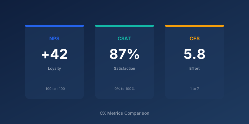
NPS tells you whether loyalty is moving. It does not tell you why a customer is dissatisfied, which is CSAT territory, and it does not tell you where the friction sits in a process, which is what CES is built for. The strongest programmes layer all three: NPS for the strategic view, CSAT for touchpoint diagnostics, CES for removing effort. We compare them properly in NPS vs. CSAT vs. CES, and if churn is the reason you are reading this at all, start with how to reduce churn.
Start simple. Be consistent. Act on what you hear, and act fast enough that the customer notices.
Frequently Asked Questions
Ready to know what your customers actually think?
SurveyGauge helps Nordic B2B companies move from gut feeling to data-driven CX decisions.
SurveyGauge Team
Customer Experience Experts
SurveyGauge-teamet hjælper virksomheder med at måle og forbedre kundetilfredshed via professionelle surveys, analyser og rådgivning.
You might also be interested in
View all articles
What Is CSAT? Guide to Customer Satisfaction Score
CSAT is the most direct satisfaction metric you can use, but it is also the most abused. Therefore, here is how to deploy it properly, when to trust it, and when it misleads.
NPS vs. CSAT vs. CES: Which Metric Should You Choose?
NPS, CSAT, and CES measure different things, and the real question in 2026 is not which one wins. It is when to layer a second metric on top of NPS, and when adding one just adds noise.

How to Reduce Churn: 7 Strategies That Work
Churn is the most expensive problem most B2B companies underestimate. Here are seven strategies that work, from early warning systems to win-back campaigns, with the numbers behind each.